Tag Archives: Interior Design

Interior Design Principles: Harmony & Unity

18 Nov
To achieve Harmony everything in a room should be co-ordinated to express one theme, mood and style. It is very important in the initial planning of a home, or determining the interior of a room, to decide on the mood or style that you want created. And it is necessary to think of the house as a totality; a series of spaces linked together by halls and stairways with a common style and theme running throughout. This is not to say that all interior design elements should be the same but they should work together and complement each other to strengthen the whole composition. A way to create this theme or storyline is with the well considered use of color. Color schemes in general are a great way to unify a collection of spaces. For example, you might pick three or four colors and use them in varying shades throughout the house.
 

Well designed, harmonious master bedroom

 
A well-designed room is a unified whole that encompasses all the other elements and principles of design. Unity assures a sense of order. There is a consistency of sizes and shapes, a harmony of color and pattern. The ultimate goal of decorating is to create a room with unity and harmony and a sense of rhythm. Repeating the elements, balancing them throughout the room, and then adding a little variety so that the room has its own sense of personality accomplishes this. Too much unity can be boring; too much variety can cause a restless feeling. Everything from the trimmings on the lamp shade, the colour of the piping on the scatter cushion, to the light switches and cupboard handles need attention. As colour expresses the whole spirit and life of a scheme, details are just as important. They should not be obvious but they should be right and enhance the overall feel of the room. Juggling the elements and principles to get just the right mix is the key to good design.


Well designed Living Area – everything fits the Natural theme


Personal Note: Finally it feels like summer in New Zealand. It is nice and warm, the perfect weather for last Sunday’s School Gala and my open studio day, where I invited children to come in and make their own Christmas cards.

Have a happy and wonderful day!”   Beate


Interior Design Principles: Proportion and Scale

7 Nov

Good example for using two contrasting colours to create different areas in one large room

Proportion is primarily concerned with the relationship of one part to another. Our eye is pleased with good proportion and disturbed by poor proportion, but the choice remains a personal judgment.  It involves every aspect of design and is extremely visual. In Interior Design there is a “two-thirds to one thirds” rule as reference for the selection of colours, textures and patterns. Ancient Greeks designed all their buildings on the Golden section 2:3

Scale refers primarily to the relative size or character of an object or to its parts. This is in comparison with other objects either in whole or in part. A chair is small and a table is large, but either can be small or large in scale depending on the space they are placed in. Human scale too is of vital consideration. Rooms, furniture and equipment must be suitably scaled and designed to meet people’s needs and requirements. The basic aim of form follows function is lost if human scale is not considered. For example a kitchen should always be designed for the person who uses it most. Heights of work benches can be adjusted in relation to the person’s height, the implementation of the “work triangle” is important for a practical design.    

Often problems with proportion and scale in rooms are either they are  too small (dark, low ceilings) or too large (feels cold and unwelcoming). But there are many Interior design tools and tricks to still turn these rooms into cozy and comfortable spaces:

Interior design tips for small spaces and rooms with low ceilings: 

  • Use light colors on the walls
  • Paint the ceiling white, or lighter than the walls
  • Have lots of light – and use up lighters, to highlight the light ceiling
  • Keep home decor simple – limit patterns and choose small designs
  • Use mirrors and glossy finishes
  • Streamline your furniture – keep open spaces in mind when arranging them
  • Stay as tidy and uncluttered as possible
  • Consider a simple style – traditional designs can be too fussy and cluttered
  • Match the scale of your furniture to the scale of your room  
  • Wallpaper with vertical stripes can make low ceilings seem taller

Interior design tips for large rooms and high ceilings:

  • Use a darker color on the ceiling than on the walls
  • Bring the darker ceiling colour down to picture rail level
  • Use large scale, bold patters
  • Use lots of interesting, rough or fluffy textures
  • Try to create different areas by using colour as optical dividers
  • Use room dividers, columns or furniture to create smaller spaces
  • Fit lower hanging lights and down lighters
  • Use dark, warm colors on the walls
  • Use a darker color flooring
  • Match the scale of your furniture to the size of your room
  • Make sure you include lots of accessories, artworks  and décor items

 Samples for Proportion & Scale

Example for using a dark colour on the ceiling to visually lower it. A large or textured artwork on the wall behind the table would focus the eye and further improve the proportions of the room


Wonderful example for using texture, contrast and warm colours to turn a huge open space into a cosy and compfortable one


Example for a kitchen out of proportion and scale compared to the huge architectural roof design. It makes the kitchen furniture look too small and out of place


Personal Note: The last two days I had major computer problems. What a drama! But it shows how much we depend on our computers. I couldn’t do my internet banking or write my blog. And there are so many other tasks, I use the computer for. Even my son has to download his homework from the school website and he is still in Primary School! Alright, finally I am back on track, had to “de-clutter” my files and was reminded again (by my lovely husband and rescuer Bernie) to save my files on a regular base!

“In my next interior blog I will write about “Harmony”.  So, stay tuned and have a happy and wonderful day!”   Beate

Interior Design Principles: Rhythm

3 Nov

Good example for the use of repetition and contrast

In Interior Design rhythm is all about visual pattern repetition. It is defined as continuity, recurrence or organized movement. To achieve these themes in a design, you can use repetition of  lines, forms, colours or textures. Rhythm can also be created by progression, transition or contrast. Using these tools will impart a sense of movement to your space, leading the eye from one design element to another.

Repetition is the use of the same element more than once throughout the space. It can be a pattern, colour, texture, line, or any other element. Too much repetition unrelieved by contrast of some sort leads to monotony and too little repetition leads to confusion.


Example for Progression, where the eye is drawn up the stairs by increasing the height of the print collection on the wall


Progression is taking an element and increasing or decreasing one or more of its qualities. The most obvious implementation of this would be a gradation by size. A collection of vases of varying sizes on a sideboard creates interest, because of the natural progression shown. Progression can also be achieved through the order of  similar artworks increasing in height along a staircase, leading the eye to the next level, or via colour, such as a monochromatic colour scheme, where each element is a slightly different shade of the same hue.


Transition is a bit harder to define. It tends to be a smoother flow, where the eye naturally glides from one area to another. The most common transition is the use of a curved line to gently lead the eye, such as a spiral staircase or an arched doorway.

Contrast is easy to achieve by putting two elements in opposition to one another, such as a white and black pillow on a bed. Opposition can also be implied by contrast in form, such as circles and squares together or through a mix of contemporary with antique, modern paintings in a traditional room, mismatching chairs at a solid table and so on. Contrast helps to enliven a space and create interest and individuality, but it needs to be used according to the style and theme and with restraint, or it may lead to confusion.

Example for Transition, where the eye naturally follows the curved lines


Personal Note: “In my next interior blog I will write about “Proportion”.

My Kids Art & Craft Classes are in full swing.  Every Tuesday and Thursday after school I teach children how to prepare for Christmas by making their own Advent calendars, Christmas Cards, Angels, Christmas Stockings, handcrafted tree ornaments made of beads, felt, paper and fabrics, Christmas card garlands,  and so on.  We have lots of fun! I will share some easy to follow projects with you later on. Why not make it a fun weekend with your kids?   

 So, stay tuned and have a happy and wonderful day!”   Beate

Interior Design Principles: Emphasis

1 Nov


Emphasis is the focal point of the room. The focal point should be obvious as you enter the room; it is the area to which your eye is attracted and should be interesting enough to encourage the viewer to look further. Whatever is featured must be an integral part of the decoration linked through scale, style, theme and colour, so that everything else leads the eye toward the featured area.

If you don’t have a natural focal point in your space, such as a fireplace or a large window with a beautiful view for example, you can create one by highlighting a particular piece of furniture, a large artwork, an unusual sculpture, your favorite collection of things, a colourful rug or by simply painting a contrasting colour in one area.

In creating your focal point, also keep the feeling and use of the room in mind. In a bedroom the bed is often the focus as it is the purpose of the room. You can also create a focal point by grouping similar objects and compliment their surroundings in colour, shape and style. A strong focal point helps to keep the attention off the not so perfect areas in your room (like an old wardrobe door or a window with a not so attractive view).  

Good lighting is important to illuminate the focal point as appropriate. Many rooms suffer from a lack of dominance or a proper focal point, which results in boring interiors. What is the focal point in each of your rooms?

 Some examples for Emphasis (focal pooints) in a room:


A fireplace as focal point in the living room


A large abstract painting as focal point in a dining area


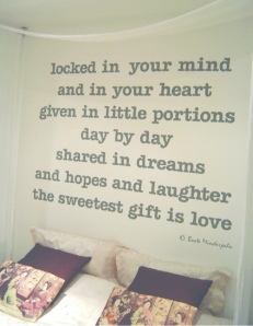
A large wall poem as focal point in a bedroom

Personal Note: “In my next interior blog I will write about the third principle “Rhythm”.

What a wonderful “Halloween Picnic” we had yesterday in our local park. Lots of families and kids came and enjoyed it. Even the sun was kind enough to shine for us.  

 So, stay tuned and have a happy and wonderful day!”   Beate


Interior Design Principles: Balance

31 Oct

Balance can be described as the equal distribution of visual weight in a room. An object’s visual weight is the amount of space it appears to occupy. A well-balanced room gives careful consideration to the placement of objects. The relationship between them, their colour, form, texture, pattern, and light are important aspects to achieve a great look and a feeling of completion.  In a room the mere arrangement of fireplace, doors, windows etc. can create the balance already. Unbalanced rooms create discomfort.  

There are three styles of balance: symmetrical, asymmetrical, and radial.

Symmetrical balance is usually found in more traditional interiors. Symmetrical balance is characterized by the same objects repeated in the same positions on either side of a vertical axis, for example in bedrooms, where both sides of the bed have the same night tables, lights, chairs etc.  Symmetry is a good way to achieve a sense of order and is often used, when formal effects are wanted, when focusing attention on something important is desirable, when the use of the room suggests symmetry or when contrast with natural surroundings is sought.

Example for a symmetrical balanced bedroom

Asymmetrical balance is often used in modern designs to create more lively interiors. Here balance is achieved with some dissimilar objects that have equal visual weight or eye attraction. Asymmetrical balance is more casual, but more difficult to create, because it suggests movement, spontaneity and informality. It is less obvious than the formality of symmetry and allows full freedom and flexibility in arrangements for utility as well as for beauty and individuality.

Example for an asymmetrical balanced bedroom

Radial symmetry is when all the elements of a design are arrayed around a center point, as in the spokes of a wheel or the petals of a daisy. Its chief characteristic is a circular movement out from, toward or around a centre. In homes it is found mainly in circular dining settings or spiral staircases. Though not so often employed in interiors, radial symmetry can provide an interesting counterpoint if used appropriately.

Example for a radial balanced dining room


Personal Note: “I hope you’ll enjoy my Blog and the new topic “Interior Design”.  In my next Interior blog I will write about the second principle  “Emphasis”.

Last night I went to a Halloween Party with the theme “Rocky Horror Picture Show”. That was the craziest and most bizarre costume party I ever went to….  

Later today we will go to a park and have a “Halloween Picnic” with the kids and lots of  families and lots of lollies. Fingers crossed, that the sun stays with us!

 So, stay tuned and have a happy and wonderful day!”   Beate

Principles and Elements of Interior Design

30 Oct

In the following series of blogs, I’ll introduce you to the principles and elements of Interior Design. These basics are used by professional Interior Designers as a guide in choosing each item or material to create a balanced and beautiful room setting. At the end of each article you’ll be able to recognize and maybe use the basic rules in your home. The seven principles of design are

  • Balance
  • Emphasis
  • Rhythm
  • Proportion
  • Scale
  • Harmony
  • Unity


The following 10 elements are the tools you can use to achieve the desired interior in relation to the above principles:

  1. Mood
  2. Style
  3. Space
  4. Line
  5. Form
  6. Colour
  7. Texture
  8. Pattern
  9. Contrast
  10. Lighting


Personal Note: “I hope you’ll enjoy my Blog and the new topic “Interior Design”.  It might be a bit confusing right now, but I am very excited to write about it, to explain the concepts in detail and to find photos with good examples.

My next blog will give you an insight into the first Design Principle “Balance”. So, stay tuned and have a happy and wonderful day!”   Beate